
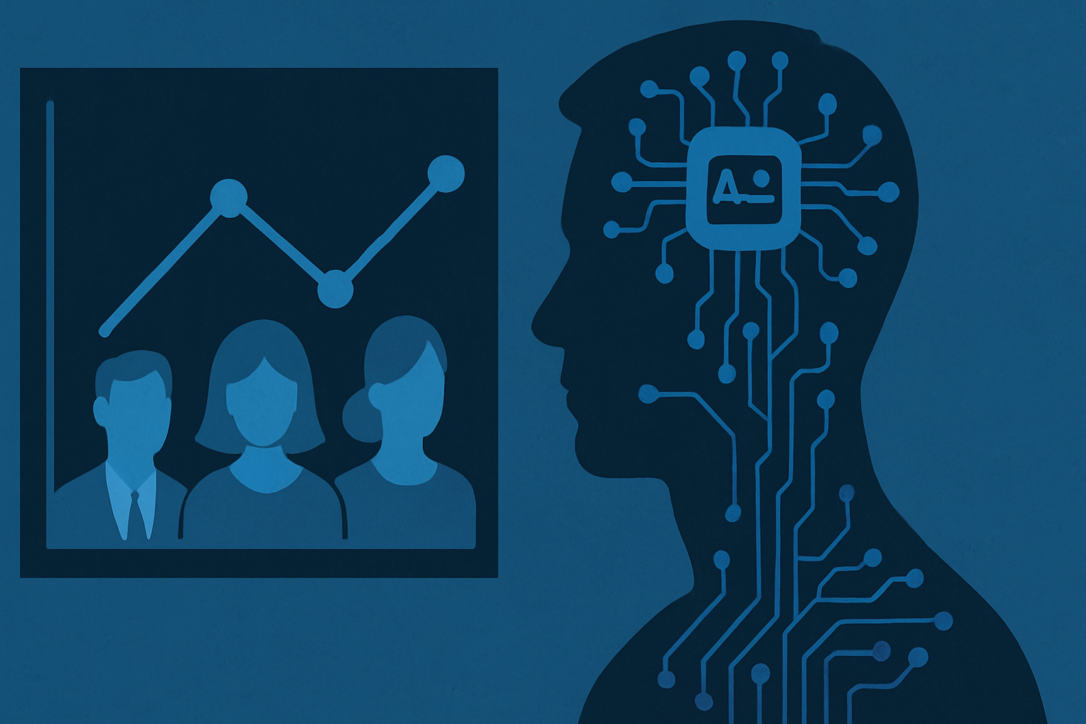
Dashboards Promise Instant Clarity but Not Instant Understanding
Walk into any boardroom today and you will find brightly lit screens displaying turnover rates, engagement scores, diversity ratios, and performance indexes. The dashboard has become the centerpiece of modern HR technology. Vendors promote these tools as if they were crystal balls that can instantly reveal the health of a workforce, promising leaders the ability to make faster and smarter decisions. At first glance the promise is irresistible: the chaos of human behavior distilled into neat charts, color coded widgets, and performance gauges that can be consumed in seconds. Executives love the simplicity because it suggests that the messy complexities of people management can be tamed with software. For HR teams under pressure to prove their strategic value, dashboards appear to deliver legitimacy and efficiency in one sleek package. Yet the critical question remains: do these interfaces genuinely deepen understanding of employees, or do they merely create the illusion of insight by hiding more than they reveal?
Turning Complex Human Realities into Simple Graphs Risks Distortion
The appeal of a clean, colorful dashboard lies in its promise to make people data instantly intelligible. Retention rates can be represented by a line graph, employee engagement by a dial, and performance by a set of bars climbing steadily upward. Leaders glance at these visualizations and feel reassured that the organization’s human side is under control. Yet that sense of control can be deceptive. Reducing the subtle motivations of a workforce into a handful of percentages risks stripping away the very context that makes those numbers meaningful. A ten percent attrition rate may look alarming on a chart, but without understanding whether departures are due to voluntary career moves, toxic management practices, or competitive poaching, the graph tells only half the story. Similarly, an uptick in “employee satisfaction” could mask deeper frustration if the survey questions were framed narrowly or interpreted unevenly across teams. Dashboards excel at compressing complexity, but their neatness can turn messy realities into simplistic narratives. For leaders and decision makers, the temptation is to take the metric at face value. A provocative question arises: are these tools helping us see employees more clearly, or are they blinding us to the deeper truths about culture, motivation, and inclusion that never fit neatly into a pie chart?
Data Quality and Bias Can Undermine the Shine
Every chart on a people analytics dashboard is only as reliable as the data beneath it. The problem is that HR data is rarely pristine. Employee surveys can be rushed through without reflection, performance ratings often mirror a manager’s unconscious preferences, and recruitment algorithms may be trained on historical records riddled with bias. When these inputs are messy, the output looks scientific but is built on shaky ground. A dashboard can display “objective” metrics down to two decimal places, yet if the underlying data is skewed, the precision is an illusion.
Leaders who lean on such numbers risk making decisions that reinforce inequities rather than correct them. For example, an AI credit model might downgrade applicants from neighborhoods with limited access to traditional banking, not because of individual creditworthiness but because of systemic economic disadvantages. When translated into dashboard scores, these patterns appear neutral, yet they replicate old forms of exclusion in a digital shell.
For HR executives, the lesson is uncomfortable but necessary: the true challenge is not collecting more data, but scrutinizing its origins, understanding its blind spots, and ensuring that the technology does not amplify the very biases it claims to solve.
Metrics Feel Objective but Are Built on Subjective Choices
Numbers wear the mask of neutrality. A dashboard filled with percentages and tidy charts conveys the sense that judgment has been eliminated and truth has been distilled into digits. Yet every number is the product of human choices about what to measure, how to categorize, and which dimensions to ignore. When HR leaders see an engagement score of 72 or a performance index of 3.4, it feels scientific. In reality, those metrics are built on survey questions designed by someone with assumptions, or performance scales defined by managers with particular cultural biases.
What gets counted – and what does not – shapes decisions as much as the figures themselves. A company that measures absenteeism may punish employees for taking mental health days, while another that tracks collaboration might elevate popularity over productivity. By presenting a selective slice of reality as a neat chart, dashboards risk hard-coding subjectivity into the heart of HR decision making. Leaders who mistake these numbers for objective truth may end up amplifying the very problems they hoped to solve, rewarding conformity while overlooking hidden talent.
Dashboards Should Trigger Dialogue, Not Replace It
The most valuable function of a dashboard is not to provide final answers but to raise the right questions. A sudden drop in engagement scores should spark conversations about workload, leadership style, and organizational culture. A spike in absenteeism should encourage managers to explore whether stress, burnout, or lack of flexibility are driving the pattern. Yet in too many organizations, dashboards are treated as substitutes for dialogue. Executives glance at the charts, issue directives based on surface-level numbers, and move on to the next meeting without ever engaging with the human stories behind the data.
When numbers become the only language of decision making, the lived experiences of employees risk being silenced. People analytics should never be reduced to automated scorecards detached from context. The data must be paired with qualitative insights gathered through listening sessions, open forums, and ongoing feedback loops. Dashboards can act as conversation starters, but the real understanding emerges in dialogue between leaders and their teams. Without this layer of interpretation, organizations risk mistaking colorful charts for wisdom and treating employees as datapoints rather than active participants in shaping workplace realities.
From Shiny Interface to Strategic Tool: Building Better HR Tech Practices
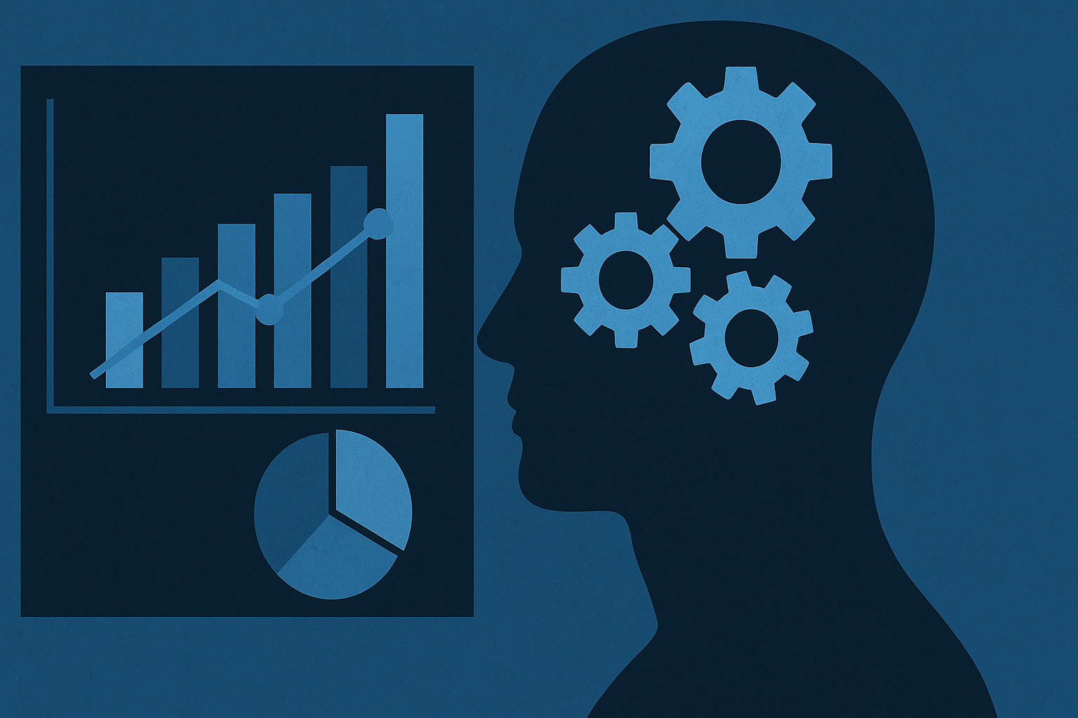
People analytics dashboards are powerful, but their power is double edged. They can illuminate workforce trends in ways that were unimaginable only a decade ago, yet they can also flatten complexity into deceptive simplicity. Leaders who treat dashboards as ultimate truth risk chasing numbers instead of understanding people. The real opportunity lies in reframing these tools as starting points rather than finish lines.
An effective dashboard is not the end of analysis but a compass that points toward areas requiring deeper exploration. To achieve this, organizations must pair data visualization with data literacy, combine quantitative insights with qualitative voices, and cultivate a culture that questions rather than blindly accepts metrics. HR technology becomes genuinely strategic when it respects the richness of human experience while leveraging the discipline of analytics. Used responsibly, dashboards can move beyond glossy interfaces to become instruments of insight that inspire meaningful action.
What is Talent-in-Q?
It’s an AI recruitment assistant that screens, scores, and shortlists candidates automatically, helping hiring managers save up to 50% in time-to-hire.
How does it reduce bias in hiring?
Talent-in-Q applies standardized criteria with NLP models, mitigating unconscious bias and improving fairness.
Can it assess soft skills?
Yes. Our behavioral scoring engine evaluates tone, mindset, and cultural fit beyond CV keywords.
Who uses Talent-in-Q?
Hiring managers in enterprises, startups, NGOs, and FMCG firms seeking efficiency, fairness, and predictive insights.
Does it integrate with ATS systems?
Yes. It connects seamlessly to applicant tracking systems (ATS) for smooth workflows.
What ROI can HR expect?
Faster recruitment cycles, better candidate fit, and lower turnover—directly boosting HR efficiency.
Ressources :
- 8 Essential People Analytics Dashboard Examples – OneModel
- People Analytics in 2025: Practices, Metrics, and Dashboards – AIHR
- 5 People Analytics Dashboard Examples + Expert Tips – Mesh AI
- How to Be Great at People Analytics – McKinsey & Company
- How CHROs Can Power Up Their People Analytics – SHRM
- https://h-in-q.com/analytics/
- https://h-in-q.com/blog/culture-meets-code-data-values-vs-behaviors/
- https://h-in-q.com/blog/ai-talent-acquisition-bias-transparency/