


Introduction
A skincare brand once reported 80% overall satisfaction with a new product; a genuinely good topline number, until a crosstab revealed that 76% of customers aged 55+ were actually unsatisfied, a signal completely invisible in the blended average. This is the entire reason cross-tabulation exists: a single overall percentage can hide the exact groups you most need to understand. Skip this step and you risk declaring a campaign or product “successful” while your most valuable segment quietly disagrees. This guide explains exactly what cross-tabulation is, walks through a real worked example, and gives you a free generator so you don’t need Excel or a statistics background to run one. At H-in-Q, we built our free Cross-Tab Generator because we kept seeing founders report topline survey results without ever checking whether those results actually held up across their key customer segments. In this guide, you’ll learn how to read a crosstab and catch the differences your averages are hiding.
What Is Cross-Tabulation: The Definition That Actually Matters
Cross-tabulation, or “crosstab,” is a statistical method that displays survey results in a table format, showing how responses to one question break down across categories of another; such as satisfaction by age group, purchase intent by region, or brand awareness by customer tier. It’s built for categorical variables: data that divides into mutually exclusive groups, like gender, region, or satisfaction level, rather than continuous numbers.
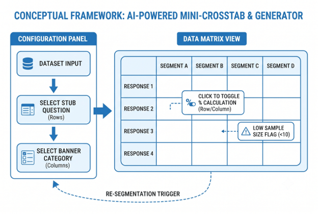
The table has two axes: the stub (rows, typically your survey question) and the banner (columns, typically your demographic or segmentation categories). At each intersection, you see the count or percentage of respondents who fall into both categories at once. A topline number tells you what happened. A crosstab tells you to whom, and those two answers can point in opposite directions. This is why cross-tabulation remains a mainstay of the market research industry despite decades of newer analytics methods.
Why Cross-Tabulation Matters for Businesses in 2026
The cost of skipping crosstab analysis isn’t abstract; it’s misread campaigns and mistargeted product decisions. A food delivery company once ran a campaign focused on faster delivery times and saw brand perception improve at the topline level, appearing broadly successful. A crosstab comparing perception by subscription type told a different story: Free users responded positively, but Premium users, arguably the most valuable segment, showed little to no positive response. Without the crosstab, the team would have concluded the campaign worked across the board.
This pattern repeats across categories. Overall results can obscure meaningful subgroup-level insights simply because larger segments dominate the blended average, hiding real dissatisfaction or disagreement in smaller but often more valuable groups. Businesses that only look at topline numbers make decisions on an average that may not represent any actual customer.
How to Create a Cross-Tabulation Table: Step-by-Step
- Clean your data first. Remove duplicate responses, decide how to handle missing values, and standardize inconsistent category labels (like “US” vs. “United States”) before building any table.
- Choose your stub question (rows). This is typically the survey question you want to analyze; satisfaction, purchase intent, brand awareness, or a coded open-ended response theme.
- Choose your banner categories (columns). These are the segments you want to compare; age group, region, customer tier, subscription type, or any other categorical variable in your dataset.
- Organize your data in tabular format. Each row should represent one respondent, and each column should represent one variable (region, tier, response), this structure is required whether you’re using Excel or a dedicated tool.
- Build the table. Count or calculate the percentage of respondents at each row-column intersection. In Excel, this is typically done with a pivot table; dedicated survey tools and crosstab generators automate this step entirely.
- Decide on percentage direction. Column percentages (each column totals 100%) let you compare across segments, like which region has the highest satisfaction. Row percentages (each row totals 100%) show how one segment splits across responses.
- Look for patterns, not just numbers. Scan for segments that deviate meaningfully from the overall average, these are the findings worth investigating further, not the segments that match the topline result.
- Test significance if the sample allows. A chi-square test determines whether the differences you’re seeing between categories are statistically significant or could plausibly be random noise, especially important with smaller subgroup sample sizes.
Cross-Tabulation Best Practices: What Works, What Wastes Time
| Practice | Why It Matters |
| Always check topline results against at least one key segment | The most important finding often hides in the segment split, not the overall number |
| Standardize categorical variables before tabulating | Inconsistent labels (US vs. United States) silently split what should be one category |
| Use column percentages when comparing across groups | Row percentages answer a different question and are easy to misread |
| Watch subgroup sample sizes closely | A crosstab cell with 8 respondents can look dramatic but carry little statistical weight |
| Code open-ended responses into themes before tabulating | Free-text data must become categorical before it can be cross-tabulated |
| Summarize findings with a clear headline per table | Stakeholders act on the callout, not the raw table |
The most common and costly mistake: reporting only the topline number and never checking whether it holds across the segments that matter most to the business, usually your highest-value customer tier, which is exactly the group most likely to be underrepresented in a large blended average.
How AI Is Transforming Cross-Tabulation in 2026
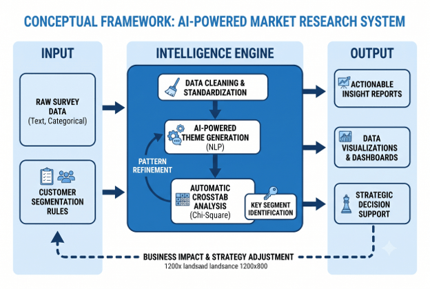
Traditional crosstab work meant manually building pivot tables in Excel, one banner variable at a time, then scanning dozens of tables by eye for meaningful patterns. AI-powered analysis tools now flag statistically significant subgroup differences automatically, surfacing the “Premium users didn’t respond” finding without requiring an analyst to manually cross every variable against every other variable.
This matters most for open-ended survey responses, which traditionally required manual theme-coding before they could be cross-tabulated at all. AI tools can now automatically generate themes from free-text feedback in seconds, turning unstructured comments into categorical data ready for cross-tabulation; a step that used to take a research team days. At H-in-Q, our free Cross-Tab Generator applies this same principle: upload your survey data, and it automatically suggests the banner variables most likely to reveal a meaningful pattern, instead of leaving you to guess which segment to check first.
Tools & Resources for Cross-Tabulation Analysis
- H-in-Q Cross-Tab Generator: free, no Excel or SPSS required.
- H-in-Q NPS Calculator: pairs directly with crosstabs segmented by loyalty tier.
- H-in-Q Sample Size Calculator: confirms your subgroups have enough respondents for reliable crosstab results.
- Excel Pivot Tables: the traditional manual method, still useful for small datasets.
👉 NPS Calculator
👉Sample Size Calculator
FAQ Section
What is cross-tabulation in simple terms?
It’s a table showing how survey answers to one question break down by another category, like satisfaction by age group. It reveals whether different customer segments actually feel differently, rather than hiding those differences in one blended average.
How do you create a cross-tabulation table?
Organize your data with one respondent per row and one variable per column, choose your stub question and banner categories, then count or percentage the responses at each intersection using a pivot table or dedicated crosstab tool.
What’s the difference between a crosstab and a pivot table?
A crosstab is the market research term for a table comparing two categorical variables, while a pivot table is the Excel feature commonly used to build one. Most market research crosstabs are technically built using pivot tables or a purpose-built survey analysis tool.
When should you use cross-tabulation?
Use it whenever you want to compare survey results across segments; age, region, customer tier, or subscription type; rather than relying on a single blended topline number that can hide meaningful subgroup differences.
A banner is the set of column categories used across a crosstab, typically demographic or classification variables like age, gender, or region. The corresponding row variables are called “stubs.”
Can you do cross-tabulation without statistical software?
Yes, Excel pivot tables handle basic crosstabs for most business needs, and free dedicated crosstab generators automate the process entirely without requiring SPSS, R, or a statistics background.
Conclusion
A topline survey result tells you what happened on average, cross-tabulation tells you whether that average actually represents the customers who matter most to your business. The food delivery campaign that looked successful overall but failed with Premium users, and the skincare product with 80% satisfaction hiding 76% dissatisfaction among older customers, are both cautionary tales for the same mistake: stopping at the blended number. Build your crosstab by choosing a clear stub question and banner categories, watch subgroup sample sizes, and always check whether your key segments agree with the topline before reporting it as fact. Ready to check yours?
H-in-Q’s free Cross-Tab Generator turns your survey data into segment-level insight in minutes, no Excel formulas required.